The
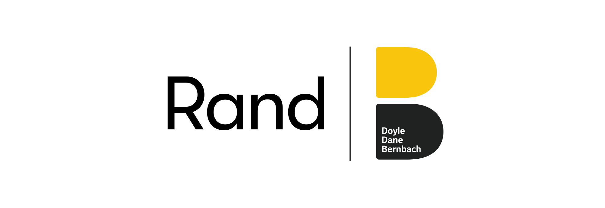
4 Hour Logo
Creating a playful and contemporary identity for a powerful AI tool.
CLIENT
- DDB Worldwide
SERVICES
- Logo Design
- Motion Design
Mission
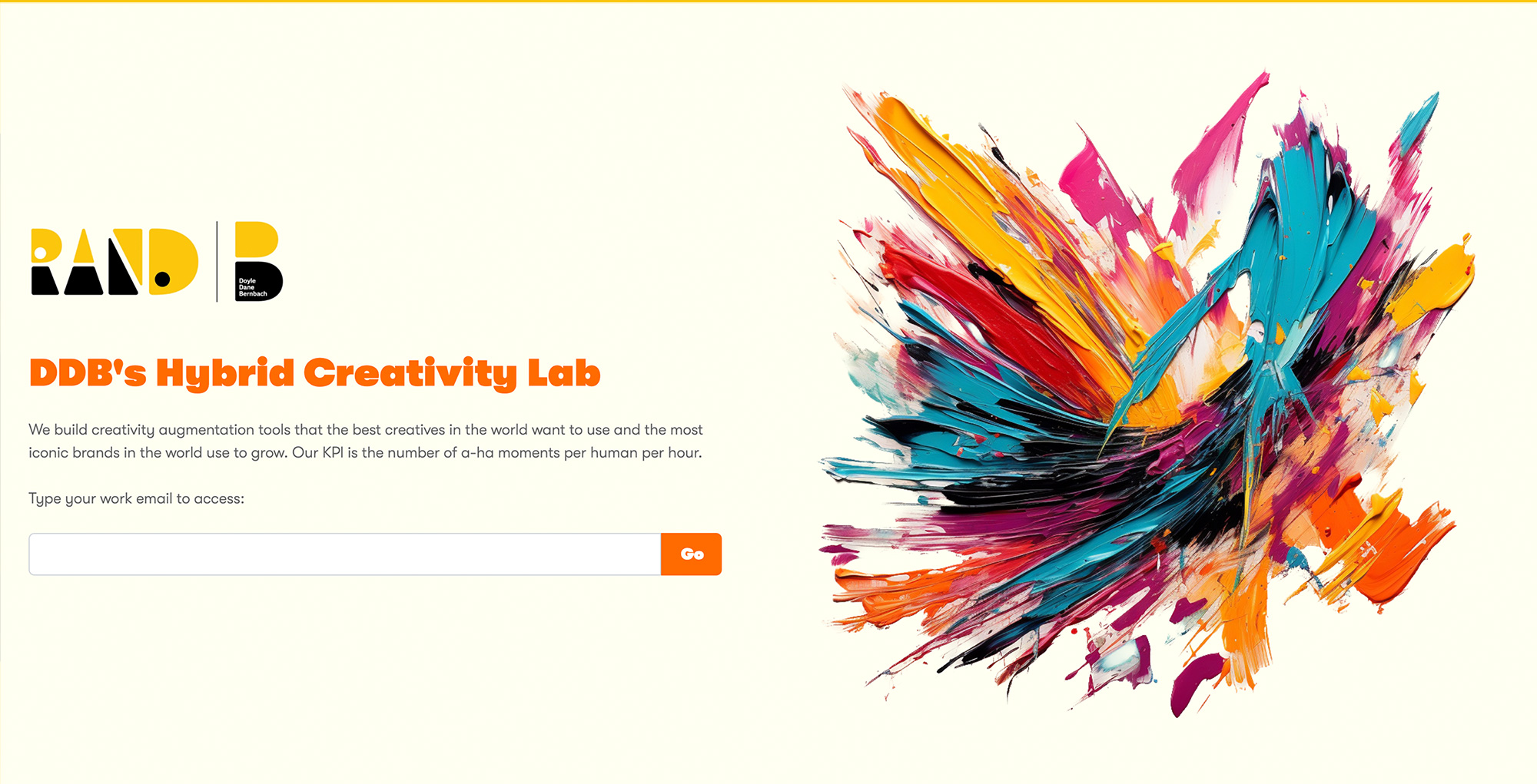
DDB is a Global Advertising agency (Cannes’ Network of the Year in 2023). Rand is the name of a first-of-its-kind AI tool created by DDB that pioneers a groundbreaking approach of generating unique creative proposals from simple one-sentence briefs. Although the results are currently basic, this proof of concept tool shows the potential of a tool that will only get better with more use.
The client urgently sought a logo reflecting creative innovation, seamlessly integrating with the agency's core identity. The swift turnaround was critical due to an impending press release, requiring the new branding to be promptly implemented on the website.
Outcome
Crafted a brand-new logo seamlessly inspired by the core identity yet creatively distinctive. The result is a contemporary and playful representation aligning perfectly with the innovative nature of the tool.
Impact
Delivered on time for the press release, the logo distinctly positions the tool as a product of DDB Worldwide while showcasing its unique contribution.
In an era saturated with AI buzzwords, the clear identity communicated through the logo signifies to the press and DDB's clients that this tool is a serious investment, not merely a trendy addition to their press releases.
Background
DDB Worldwide thrives on the belief that 'Creativity is the most powerful force in business,' as it taps into the vast potential of human emotion to reshape behavior, feelings, and transactions. Rand, their AI tool, serves as a testament to the prowess of AI, showcasing DDB's in-house capability to innovate.
Challenge
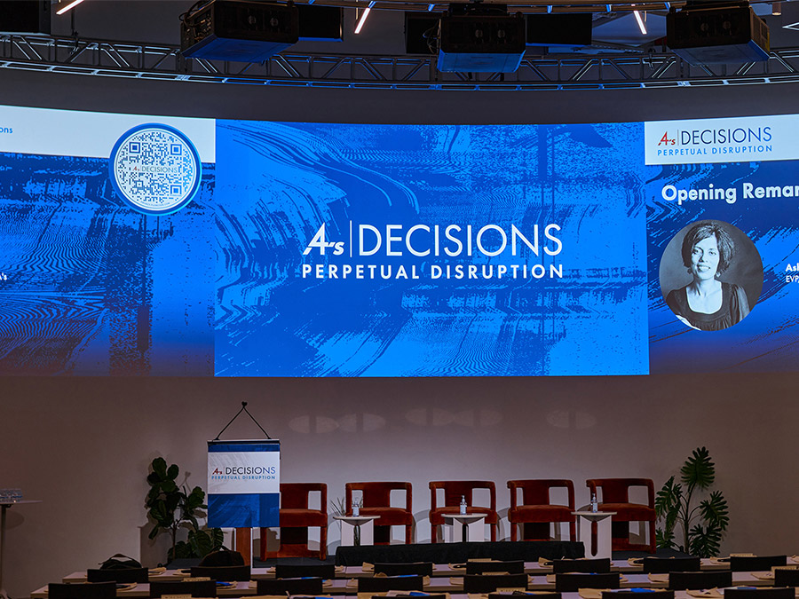
The primary challenge was the pressing timeline. With a scheduled press release and shifting deadlines, quick and efficient action was imperative. Given the diverse identities of various agencies within DDB Worldwide, a strategic decision was needed for Rand's identity—standalone and paired with DDB's logo, or seamlessly integrated with the core DDB logo.
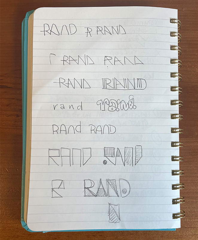
The Approach
Faced with time constraints, I swiftly adopted a proactive strategy. Presenting three distinct design directions expedited the decision-making process. Subsequent feedback allowed for a refined selection, ensuring the most suitable and effective direction.
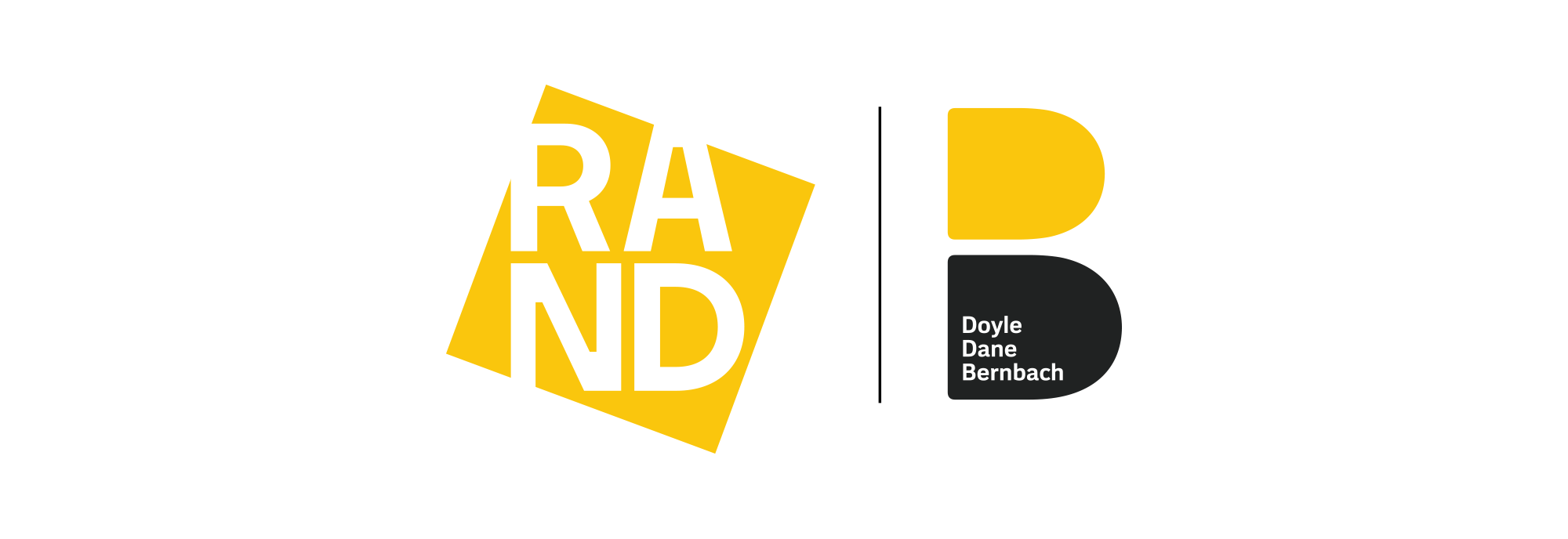
Three Directions
Considering the DDB identity's roots (Doyle, Dane, and Bernbach), featuring a logo resembling a B formed by two D's, and the core colors of black and yellow, I devised a strategy with three key dimensions:
1. Font-based option: a conservative direction focusing on typography. 2. Color-based option: emphasizing the core black and yellow palette, in a more unique way. 3. Shape-Based option: a bolder, wilder direction exploring unique shapes.
This intentional diversity allowed for a comprehensive exploration of client preferences, from conservative to experimental.
The straightforward approach combined the name of the tool in their font with their core brand. This logo would feel especially generic if not paired with the main logo mark.
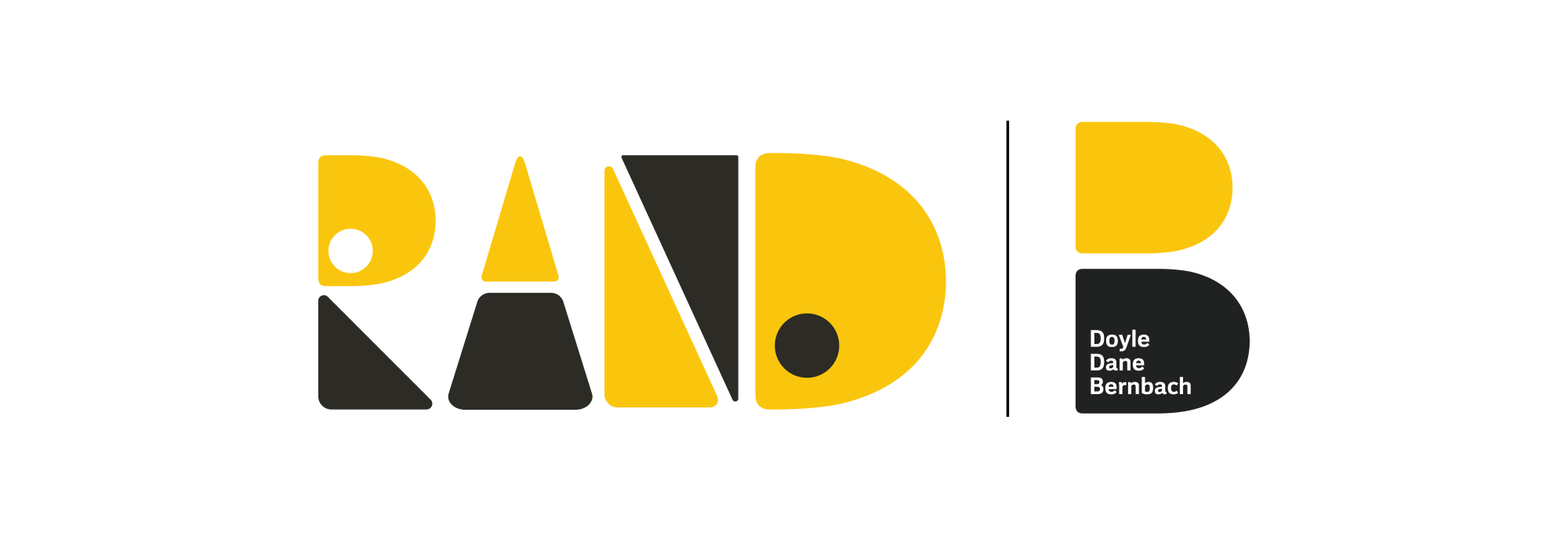
This version features an angled rectangle, evoking a sense of forward movement that aligns with the tool's cutting-edge nature. It stands alone and, aside from the color palette, maintains uniqueness distinct from DDB's core identity.
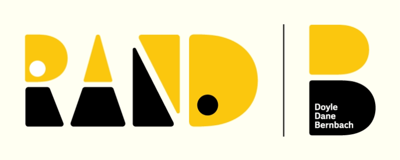
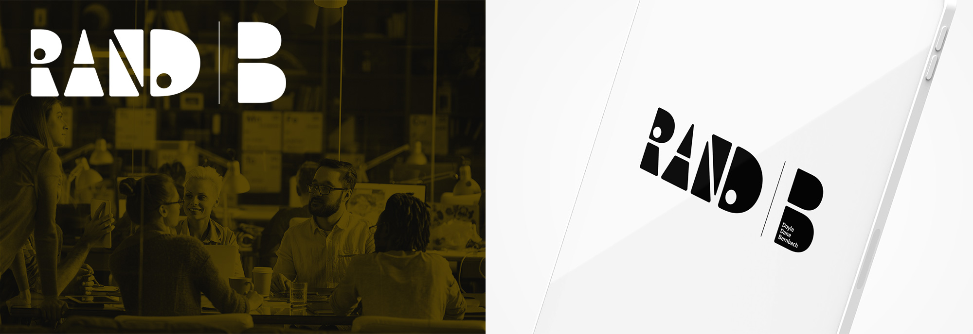
In this version, the shapes draw direct inspiration from the main logo mark. Maintaining proportional consistency, I employed the same D shape for the top of the R and the D, cleverly utilizing negative space for the A and N. This design creates an illusion where the letters emerge from the space between the shapes. Playfully accentuating the distinct shapes, I added dots to the R and D, offering a playful nod to the components shaping the entire logo. These elements also lend themselves well to animation, as discussed below.
Unexpectedly, the client swiftly chose the third option and expressed a desire for immediate use. I insisted on making minor corrections and tweaks, dedicating an additional two hours to refine specific details. This commitment ensured that the chosen option aligned seamlessly with the client's vision and maintained the highest level of precision.
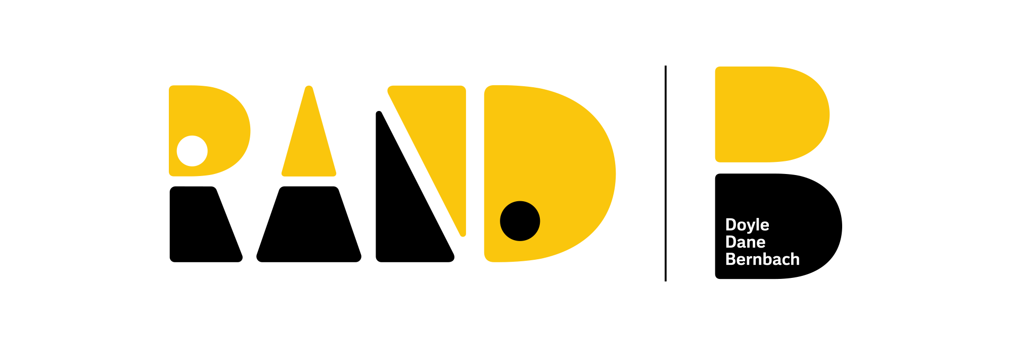
To maintain consistency, I aligned the color positions in the N, opting for a swap. I refined the R, adding a touch of clarity while adjusting the rounded corners for uniformity. Lastly, I fine-tuned the spacing between letters to achieve optimal visual balance. These meticulous adjustments ensure a cohesive and polished final design.
Following this, I generated white knockout and black versions to encompass all potential logo applications. This comprehensive approach ensures adaptability and visibility across various contexts and backgrounds.
Animation
In response to a subsequent request for an animated version, I incorporated the circles in the R and D as eyes, introducing a subtle hint of humanity within the machinery. Opting for a blinking, ponderous motion, the animation exudes a friendly and approachable vibe, steering clear of any ominous undertones. No terminators here—just a playful and engaging accent.