Dusting Off the
4A's
Creating a brand system for a 100-year-old organization.
CLIENT
- 4A's
SERVICES
- Brand Strategy
- Identity System Design
- Motion Design
Mission
Refresh all marketing and brand related products, including updating brand systems and Identifiers.
Result
A cohesive and flexible branding system that framed the 4A’s as a contemporary valued resource.
Impact
A hundred-year-old company no longer felt out of date. Their internal and external brand communications were now contemporary, systematized and cohesive.
Background
The 4A’s is an association for Advertising and Marketing Agencies. The 4A’s creates events and content aimed at individual agency departments. Their goal is to be an indispensable resource for their members and help them to remain relevant, positioned to compete, and provide the resources they need to thrive and grow. The 4A’s have been in business for over a hundred years, and while respected they were seen as outdated and in need of contemporizing
Members were questioning whether the price of membership was worth the cost, and the 4A’s needed to align their service offerings with the needs of their member agencies. Because these agencies are creative marketers, the 4A’s needed a visual refresh to show their members and the general public that they were modern, relevant and a worthwhile investment.
Challenge
Create an Identity System that makes all the products look and feel contemporary, professional, and cohesive.
Outcome
Working with key stakeholders, I created a robust and flexible Identity System which visually unified their diverse offerings and helped reestablish the 4A’s as a competitive resource.
The Approach
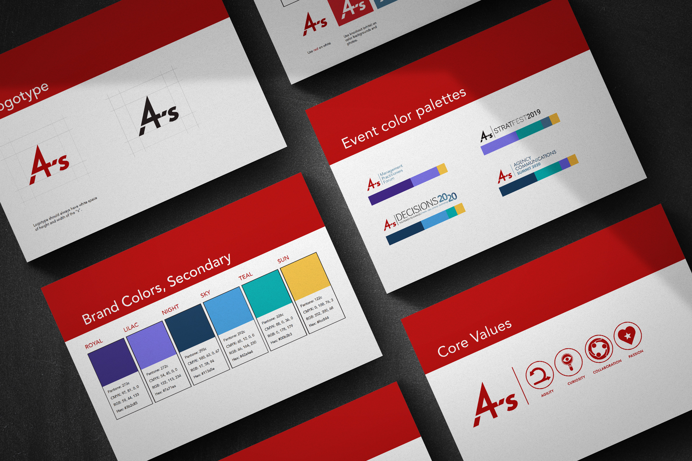
This project involved retaining some aspects of the current Identity System, including the logo, font families, and the red color of their logo, while expanding it to include their events, communications, and varied departments.
Positioning
Understanding the breadth of what the 4A’s does and who they champion helped define the positioning statement for the organization. This set the tone for everything moving forward.
The senior leadership team landed on the 4A’s positioning as “What You Need to Compete”.
I developed an entire Identity System to make sure every product and customer touch-point reflected this position.
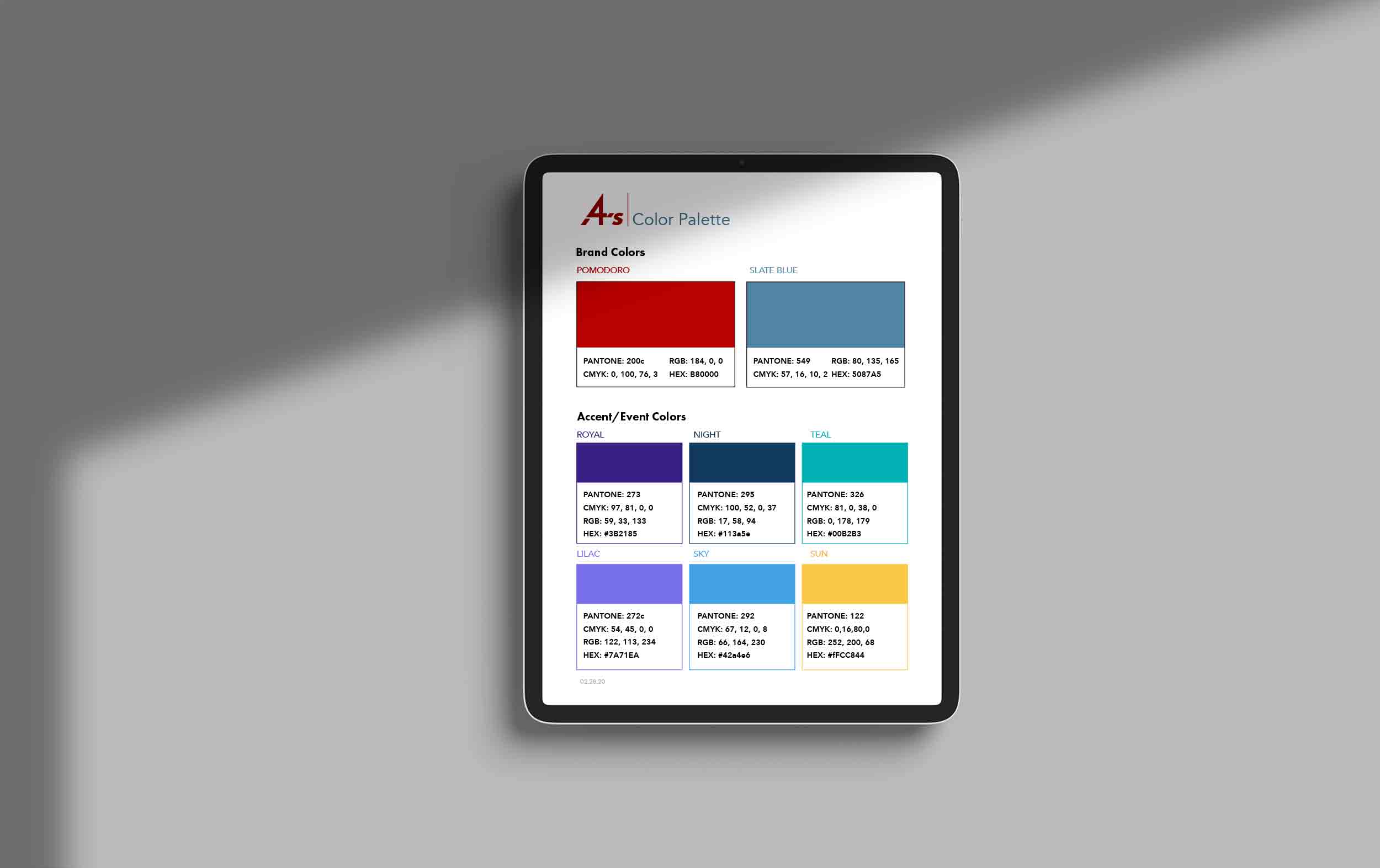
Color Palette
The palette needed to work for print and digital, and support legibility on the website. The palette had to be used across the organization by people with varying design expertise.
The first palette I landed on was very bold. It felt contemporary and cutting edge. I proposed changing the color of the logo to a coral pink, with a deep navy purple as a complimentary color. This option was rejected because the Red had historical equity and shouldn’t be altered. The Feedback was that this palette was too edgy and that I should dial it back a little.
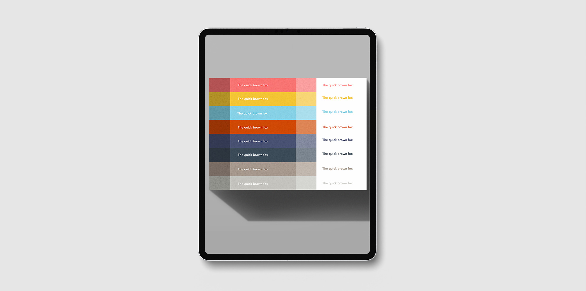
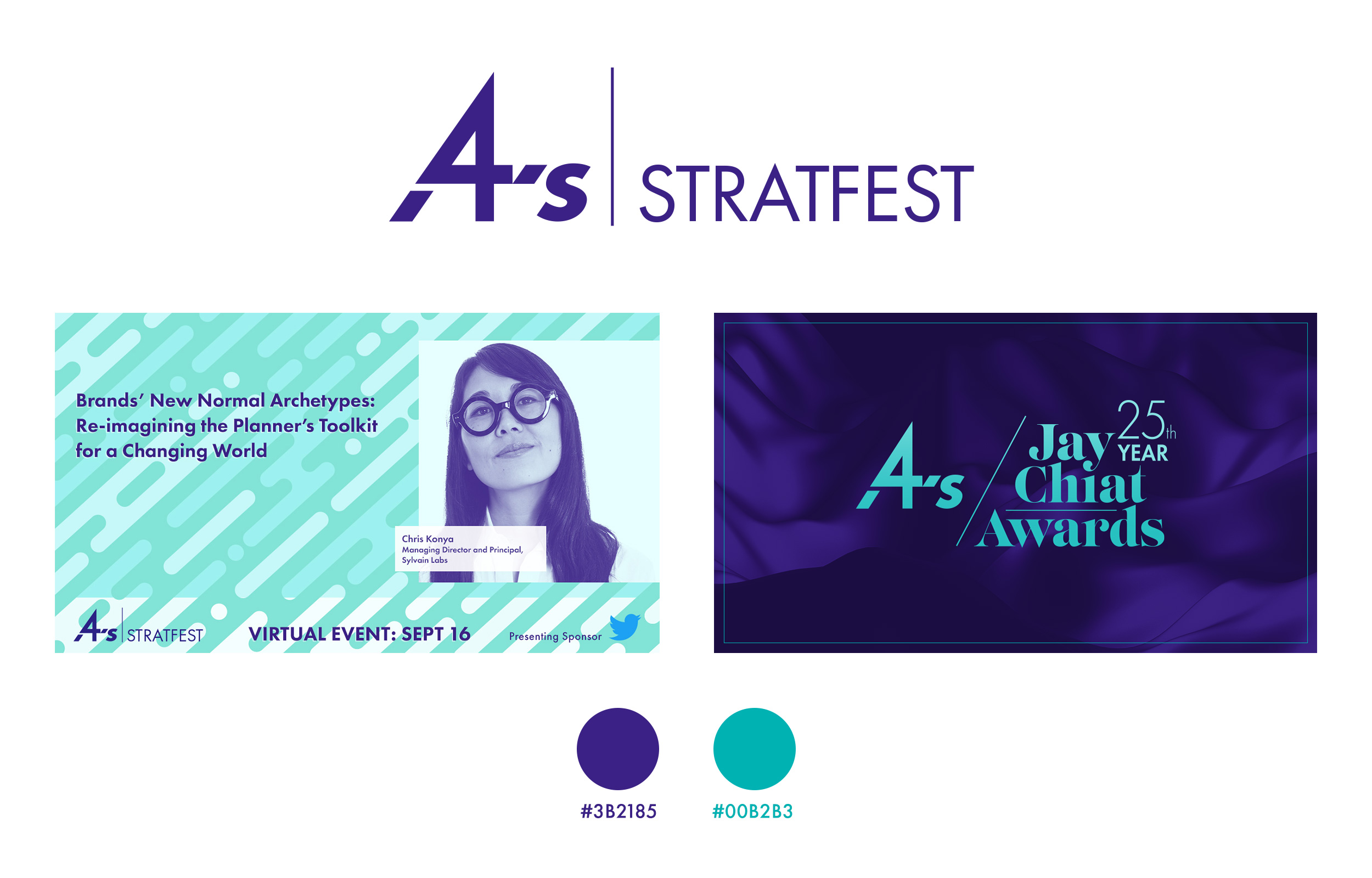
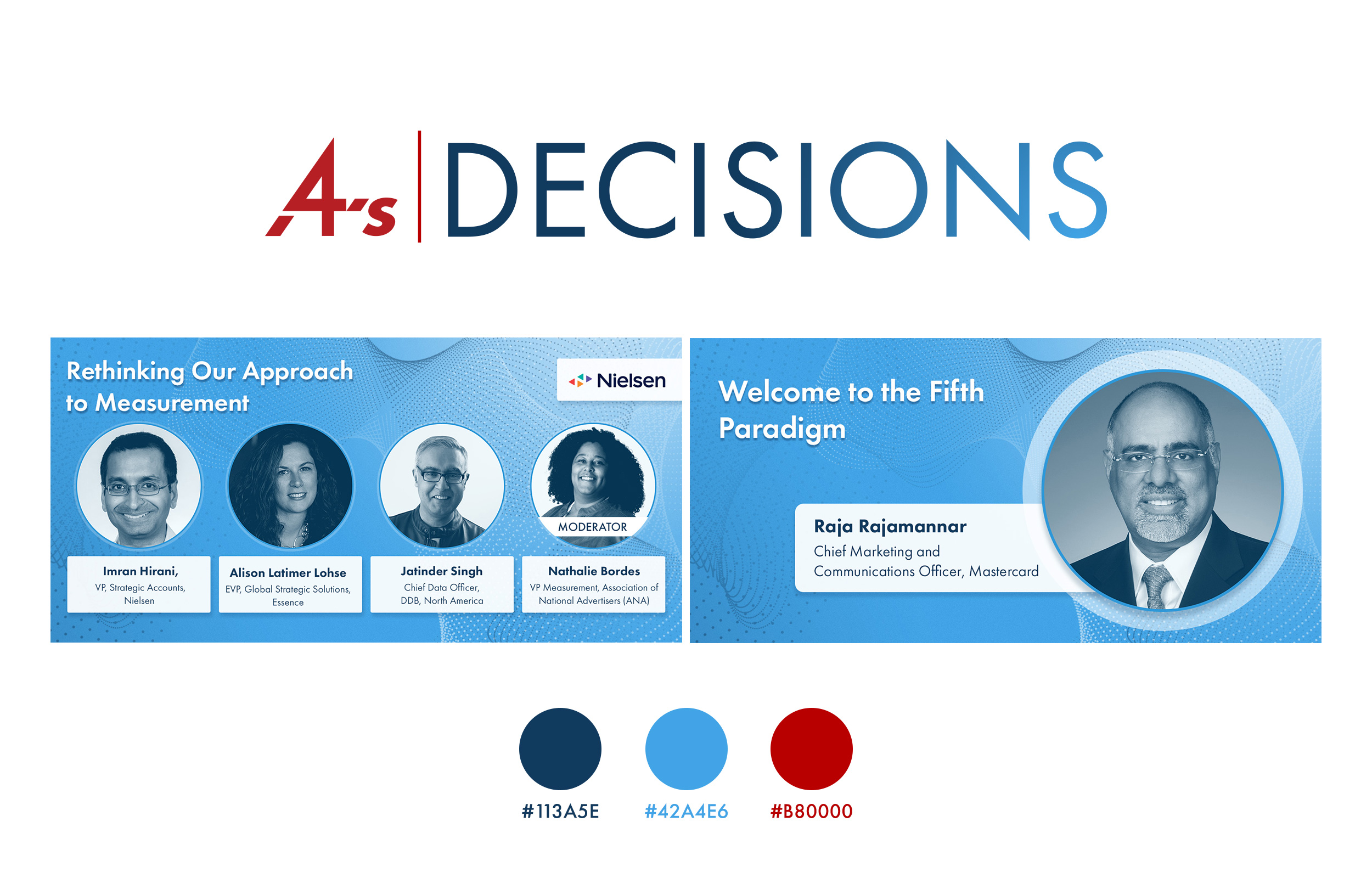
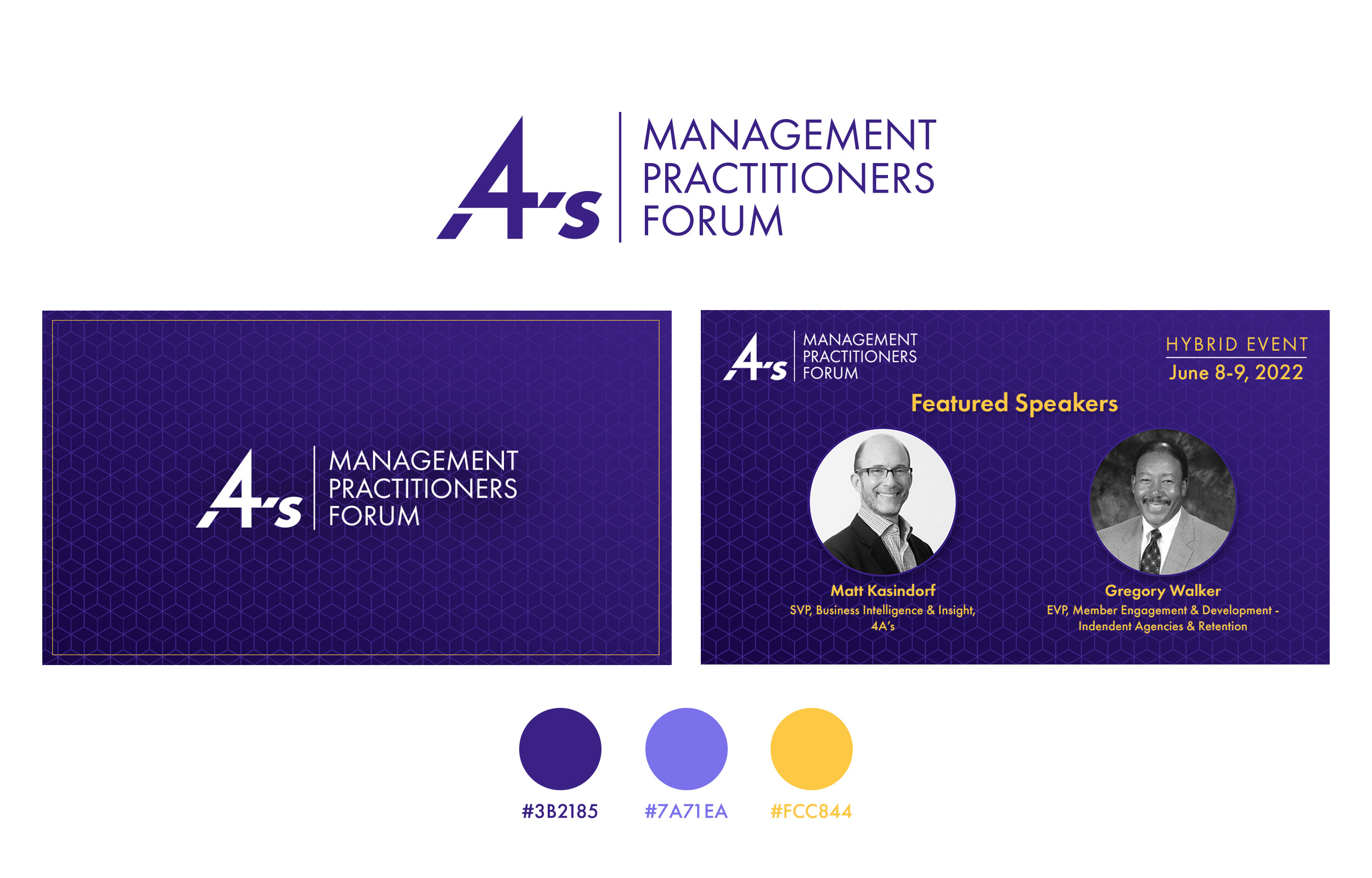
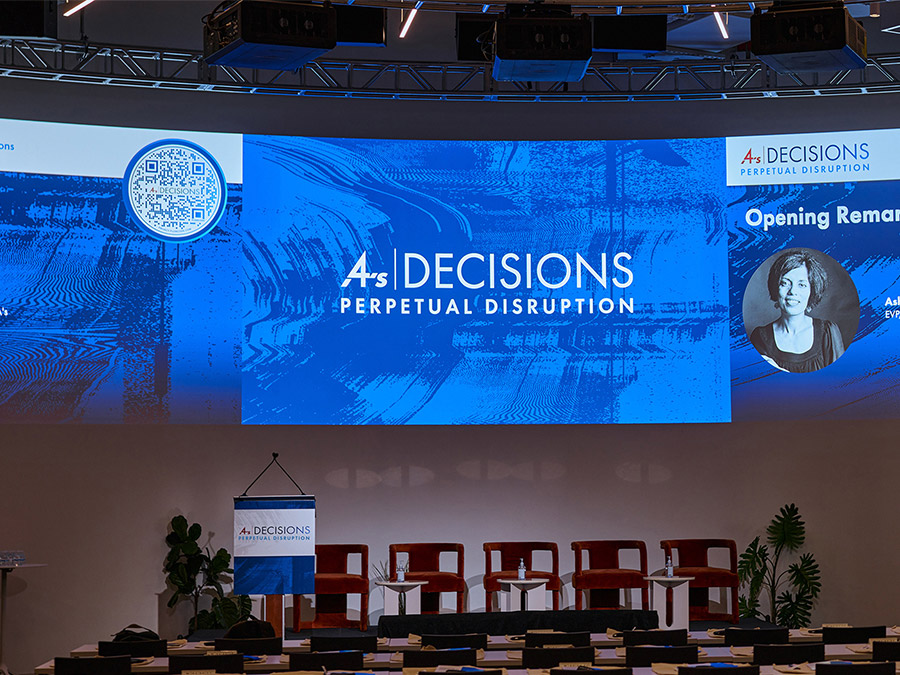
The result was a palette that had very clearly defined hues, and a lot of variety to play with. A set of two different colors from the palette was assigned to each event.
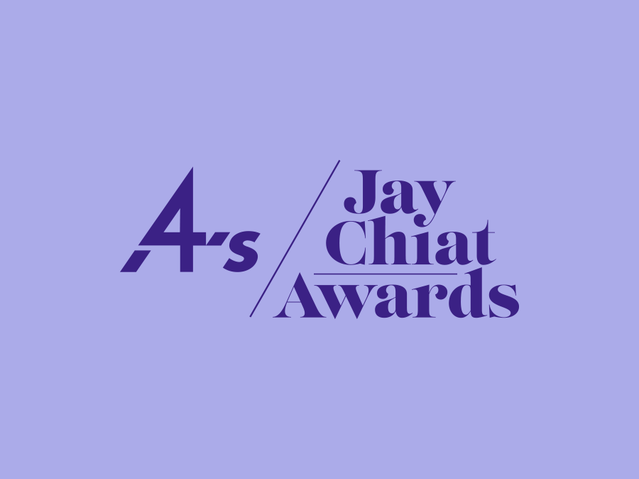
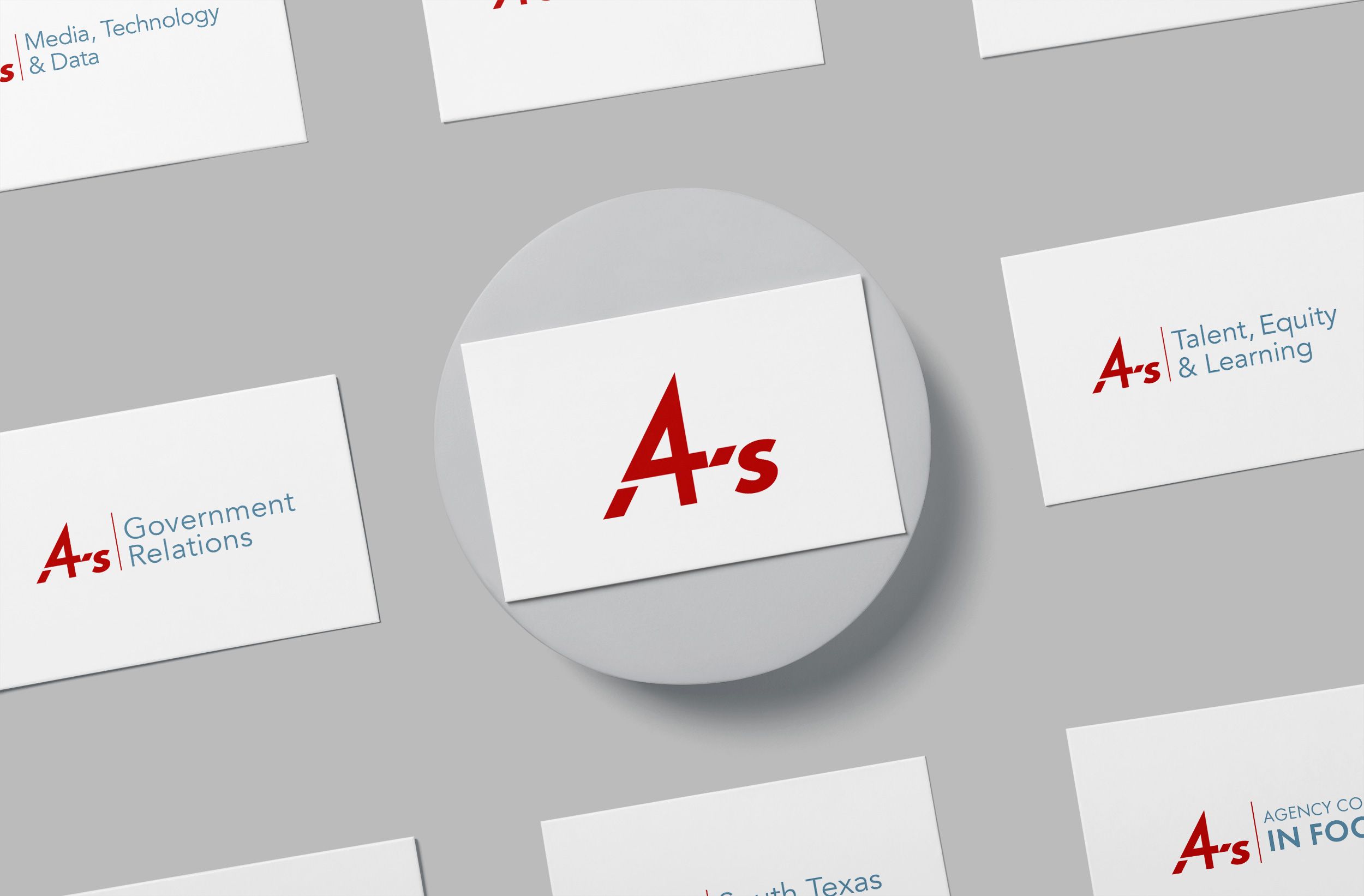
Identities
I created a flexible system that could be used for all events and webinars. The system combined the 4A’s logomark with the name of the event in a consistent manner that could be easily repeated.