How Do You Design Trust in One Page?
UX-first branding and landing page design for a law firm
CLIENT
- Personal Project
SERVICES
- Art Direction
- UX-First Strategy
- Brand Identity Exploration
- Logo & Logo Mark Design
- Landing Page Design
- UX Copywriting
Mission
The law firm needed to improve how it presents itself to prospective clients arriving under stress. With only a basic logo and an underperforming website, the goal was to establish trust quickly, communicate expertise clearly, and guide users toward taking action without overwhelming them.
Outcome
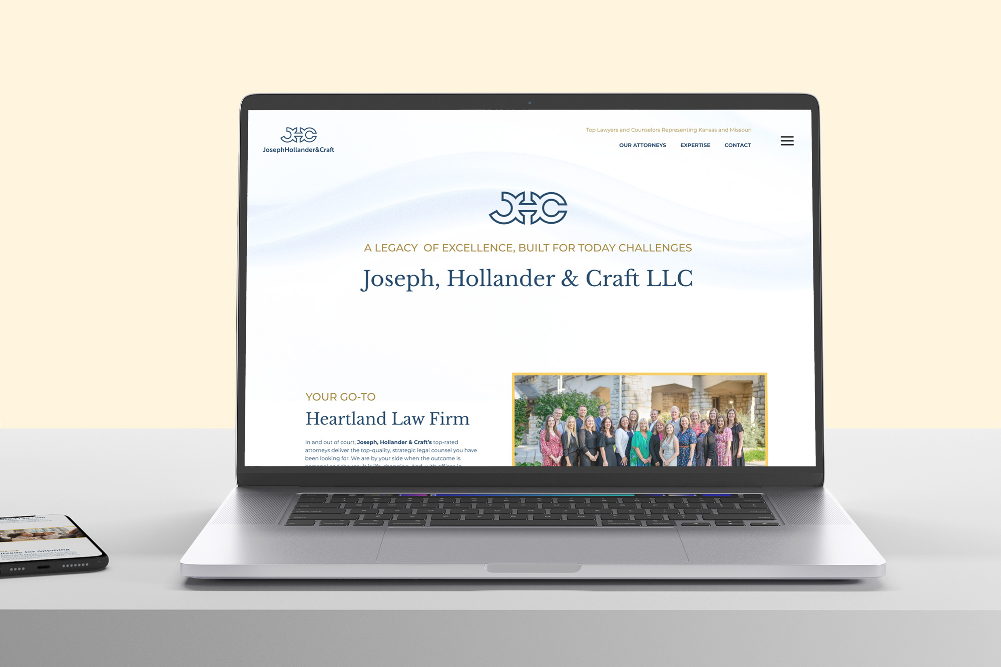
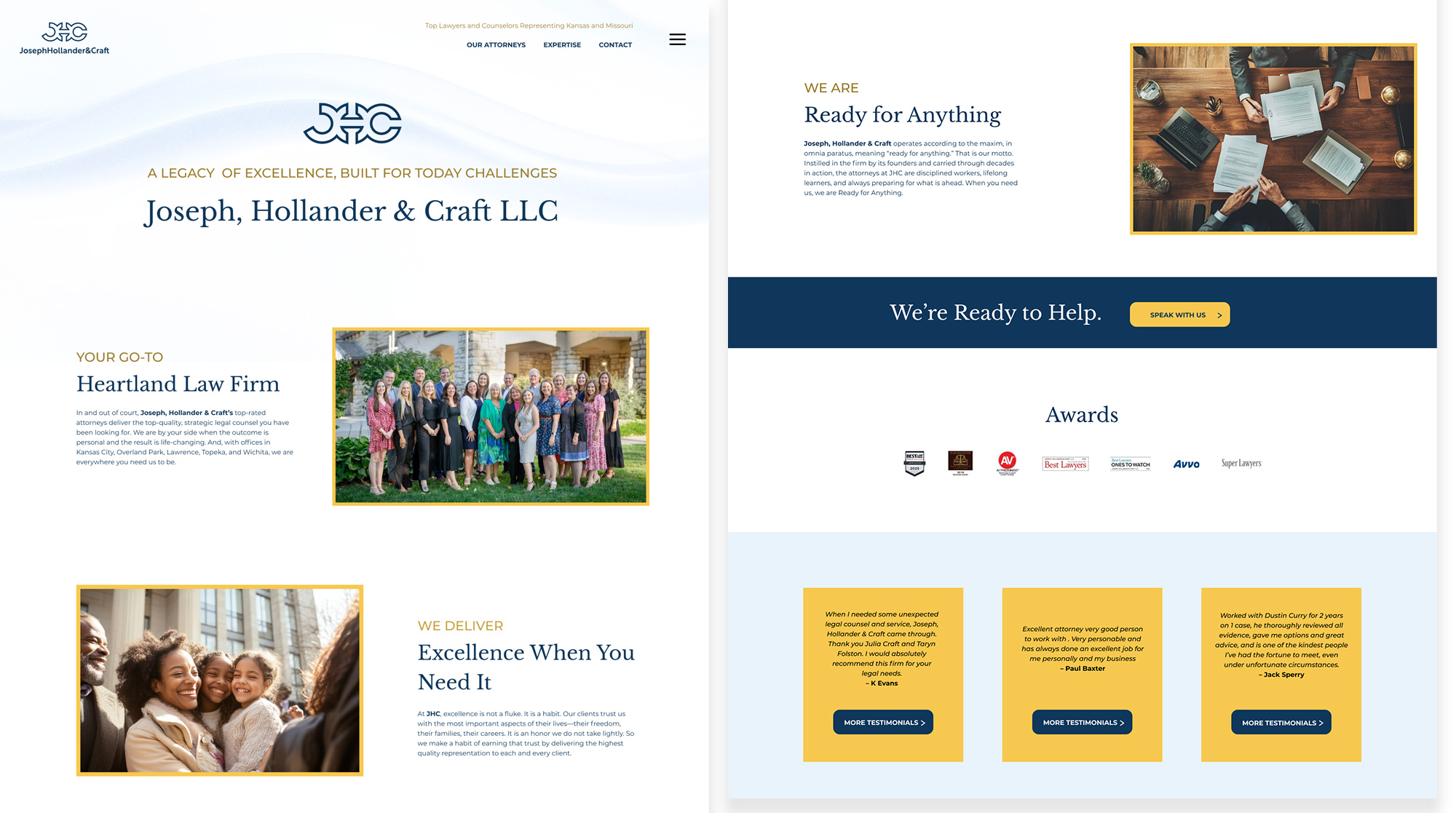
I explored multiple identity directions before focusing the core effort on a UX-first landing page redesign. The final concept reimagines structure, messaging, and navigation to prioritize clarity, calm, and ease of decision-making.
Impact
The work demonstrates how empathetic design, clear language, and thoughtful information architecture can reduce friction and improve confidence for users navigating high-stakes legal decisions.
The Goal
Create a single-page experience that helps anxious users quickly understand the firm’s value, feel reassured, and know what to do next.
The Challenge
Many law firm websites rely on dense copy, conservative layouts, and aggressive calls to action. While these conventions signal authority, they often increase cognitive load and make it harder for users to orient themselves in moments of stress.
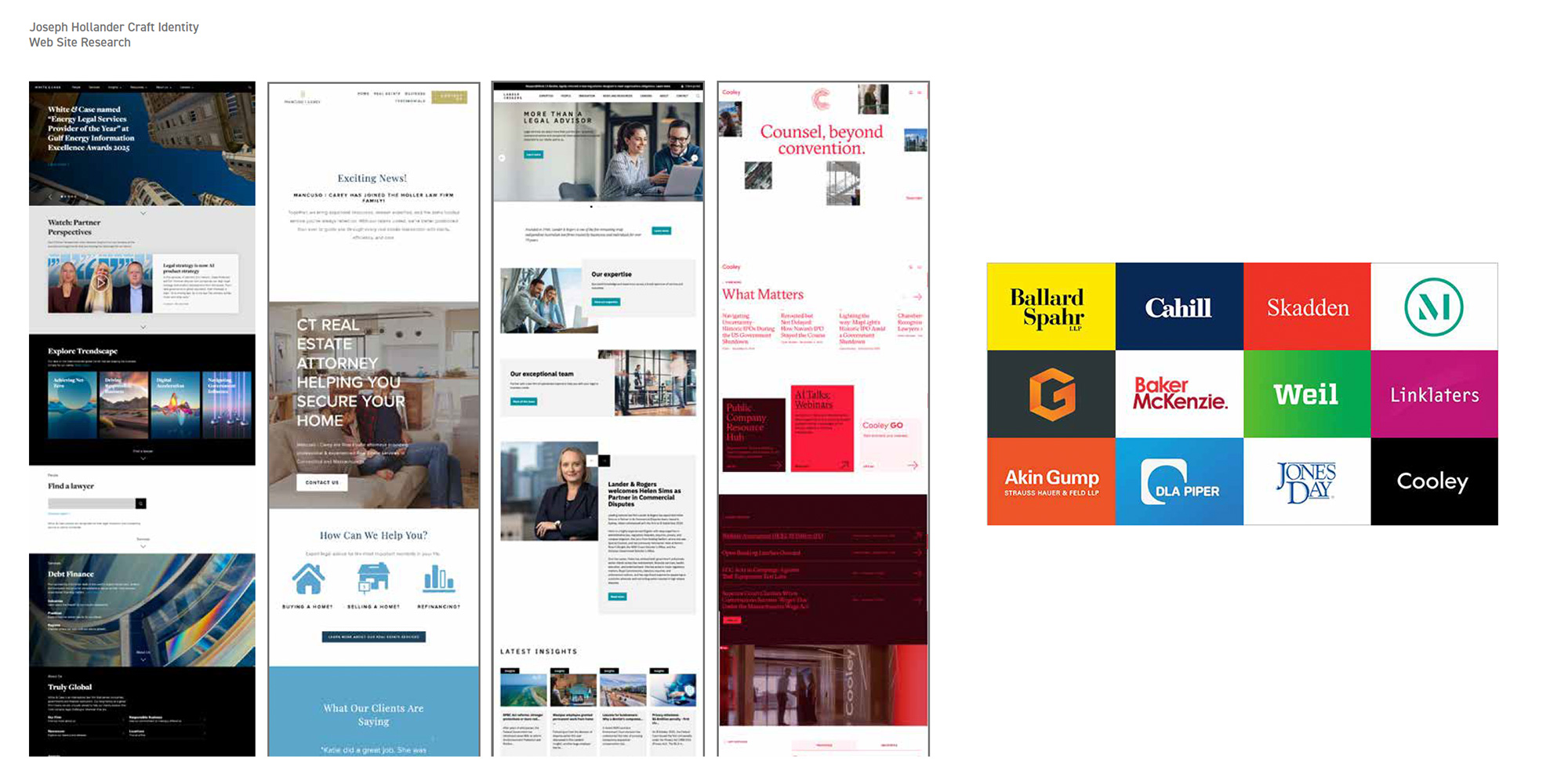
Research & Insights
I reviewed a range of law firm identities and websites to understand common industry patterns. Much of the competitive landscape prioritizes tradition and authority but often sacrifices clarity, warmth, and usability. These insights informed a direction that maintained professionalism while emphasizing readability, tone, and emotional ease.
The Decision
I treated the user’s emotional state as the primary design constraint. Rather than starting with aesthetics, the work began with content clarity and hierarchy. Typography, spacing, and language were used intentionally to signal professionalism, stability, and care.
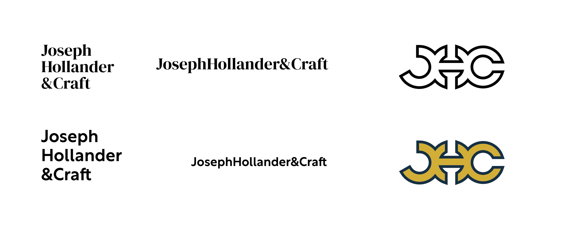
The Execution
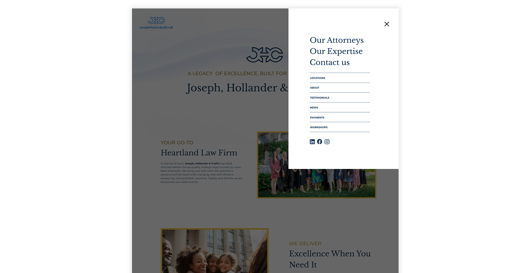
Three logo concepts were developed to explore different balances of tradition and modernity. In parallel, the landing page was redesigned from the ground up with a UX-first approach.
The final page features:
- • Rewritten, human-centered copy that addresses user concerns directly
- • A simplified navigation structure that reduces cognitive load
- • A clear mega menu organized around primary user intent rather than internal firm structure
- • Visible, well-timed calls to action placed at natural decision points
- • Improved hierarchy, spacing, and rhythm to create a calmer reading experience
- • Strategic use of testimonials and awards to reinforce credibility without pressure
Structure & Flow
Information architecture was simplified to help users find what they need quickly. The redesigned menu surfaces key actions while keeping secondary content accessible, reducing friction for users who may already feel overwhelmed.
The Result
The final concept illustrates how UX-first thinking can transform a high-stress digital experience into one that feels clear, grounded, and trustworthy. The project highlights an approach rooted in empathy, content strategy, and design restraint.
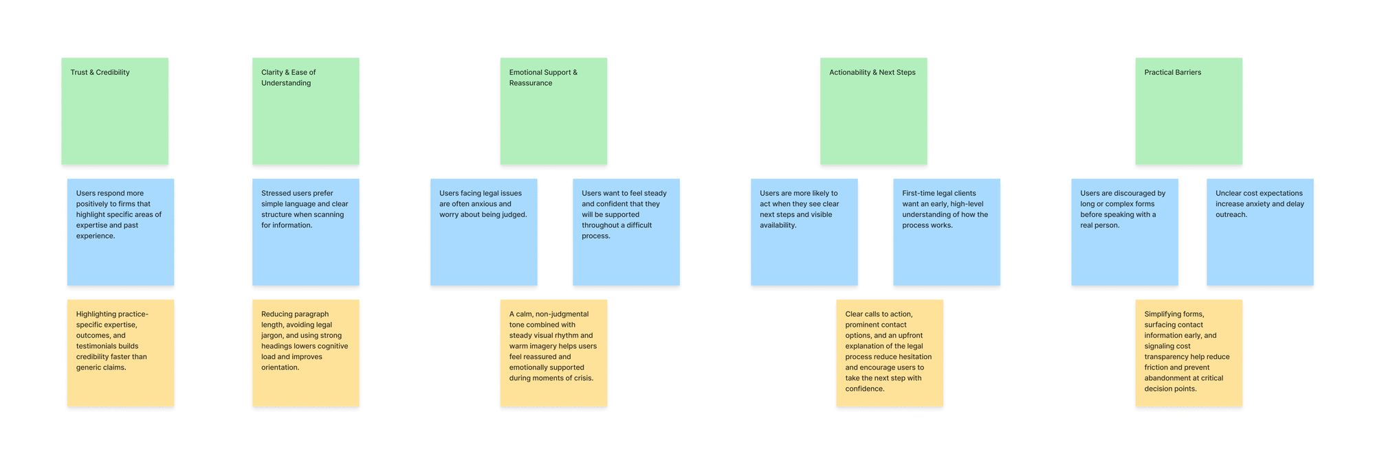
UX Themes Identified
To pressure-test design decisions, I created lightweight personas and affinity themes based on observed patterns in legal services websites and common client concerns.
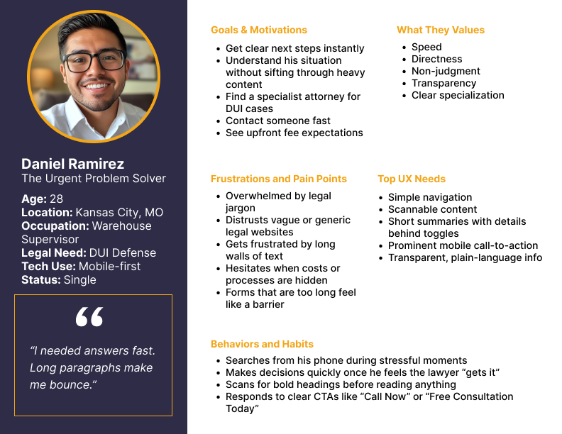
Affinity themes were developed to identify how users experiencing legal stress orient themselves, build trust, and decide when to act. These patterns directly informed hierarchy, language, navigation, and interaction design.